Rest in peace Mr. William Klein.
Word-photography pairing
Inspired by an article written by Geoff Dyer called ‘form: word + photography’ and published by Zum magazine in May 2014, I found resonance for an aspect of great relevance for me in photography that is ‘marriage of the word with the photograph’ or ‘photography’ with the word’. For me, there is often an exchange of roles, i.e., who was born first, like the story: ‘the egg or the chicken?’: ‘The word or the photo?’.
Dyer cites some books that historically fall into this category and after reading his article I was tempted to buy one and ended up buying the ‘Looking at photographs’ where John Szarkowski ‘houses’ 100 photographs from the collection of the Museum of Modern Art in New York ( the most iconic in his perspective in 1973, of course) with ‘words’ about such photos. Despite having the book in my hands for less than 24 hours, I was able to perceive real jewels – both ‘jewels-words’ and ‘jewels-photographs’ – that are in it.
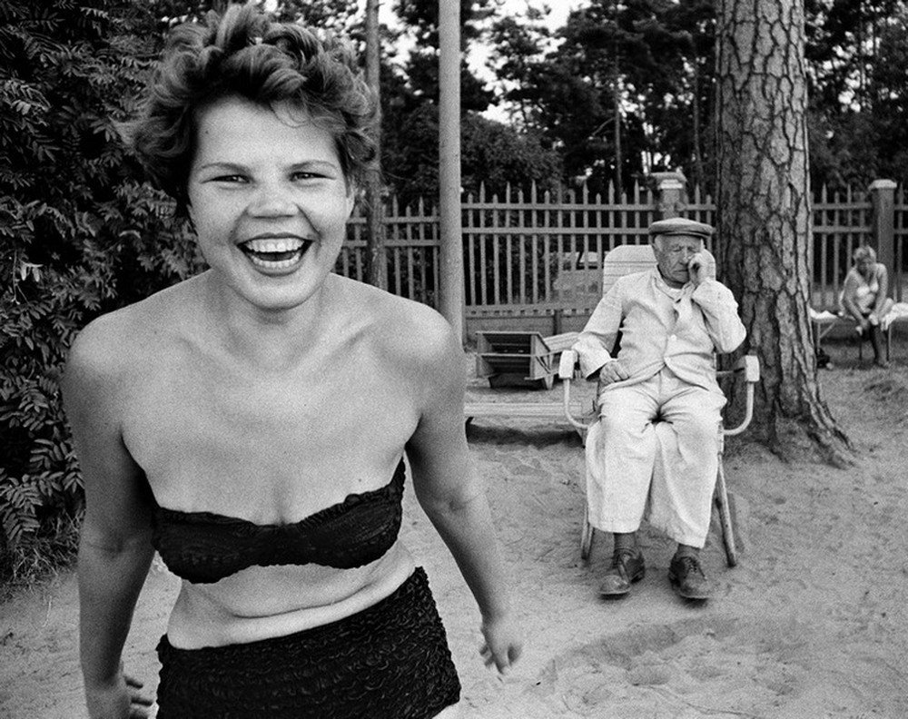
One of these gems is a photo by William Klein made in Moscow in 1959 that Szarkowski’s book does not give the name (what a mistake Szarkowski!), But I know it’s a bikini because it’s the cover of a Photofile (Thames & Hudson, 2017) from Klein that I have in my small library. “Bikini” escapes – in my modest knowledge and understanding of Klein’s work – from the ‘rule’ of (almost all) photographs by this author who excels in ‘meter’ within the rectangle, a great diversity of elements of composition. ‘Bikini’ has 6 layers or beautifully defined plans …. and, many mysteries … tensions … and, poetry.
Well, among the many things that Szarkowski talks about in this photograph, I read something I want to share:
“It was recognized long ago that so-called good photographic technique did not invariably make the best picture. Sometimes the gritty, graphic simplicity of the badly made photograph had about it an expressive authority that seemed to fit the subject better than the smooth, plastic description of the classical fine print ”.
You did well Szarkowski!!! …
——————————————————-
Inspirado num artigo escrito por Geoff Dyer chamado ‘forma: palavra + fotografia’ e publicado pela revista Zum em maio de 2014 encontrei ressonância para um aspecto de grande relevância para mim na fotografia que é ‘casamento da palavra com a fotografia’ ou da ‘fotografia com a palavra’. Para mim muitas vezes há, aí, um intercâmbio de papéis, i.e., de quem nasceu primeiro, como a história: ‘o ovo ou a galinha?’: ‘a palavra ou a fotografia?’.
Dyer cita alguns livros que historicamente encaixam-se nesta categoria e após ler seu artigo fiquei tentado em comprar um deles e acabei comprando o ‘Looking at photographs’ onde John Szarkowski ‘casa’ 100 fotografias do acervo do Museu de Arte Moderna de Nova York (as mais icônicas em sua perspectiva no ano de 1973, é lógico) com ‘palavras’ sobre tais fotos. Apesar de ter nas mãos o livro menos de 24 horas, já pude perceber verdadeiras joias – tanto ‘joias-palavras’ como ‘joias-fotografias’ – que há no mesmo.
Uma dessas preciosidades é uma foto de William Klein feita em Moscow em 1959 que o livro do Szarkowski não dá o nome (que mancada Szarkowski!), mas eu sei que é ‘bikini’ porque é capa de um Photofile (Thames & Hudson, 2017) do Klein que tenho em minha pequena biblioteca. “Bikini’ foge – no meu modesto conhecimento e entendimento da obra de Klein – da ‘regra’ das (quase totalidade) fotografias desse autor que prima por ‘meter’ dentro do retângulo grande diversidade de elementos de composição. ‘Bikini’ tem 6 camadas ou planos lindamente definidos….e, muitos mistérios…tensões…e, poesia.
Pois é: entre as várias coisas que o Szarkowski fala dessa fotografia leio algo que quero compartilhar:
“It was recognized long ago that so-called good photographic technique did not invariably make the best picture. Sometimes the gritty, graphic simplicity of the badly made photograph had about it an expressive authority that seemed to fit the subject better than the smooth, plastic description of the classical fine print”.
Mandou bem Szarkowski…